January 2 2025
When to use a box and whisker plot in a dashboard
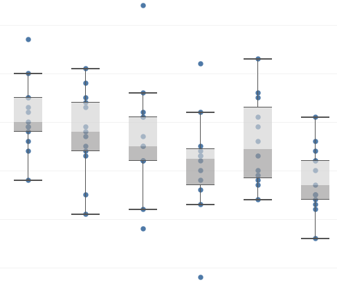
Unfortunately, almost never…
I’m a big fan of box and whisker plots. I like how it gives you a feel for the spread of a data set in one graph. You get a median, a range, a skew, an idea of outliers. I even found them kind of fun to draw when I was in year 9 maths class.
So why do I so rarely use these visualisations that I like? Well, most people didn’t like drawing them in year 9 maths class, and as a result don’t really remember what they are or how to read them. When you’re building a dashboard the user is a critical consideration. That probably sounds obvious, but it is worth highlighting. The dashboard is for users to engage with, not a way for you to show off. You don’t want the users scratching their head trying to decipher the visualisation you’ve put in front of them as they’ll just avoid using it and go back to manual reporting. You’ll be frustrated at the wasted effort, and they’ll be frustrated by not having their problem solved.
What’s the solution? Well, its back to your users. Ask them what they like. If they aren’t too sure, give them a few different options to respond to. Maybe it is a histogram. Maybe a line/bar dual axis graph. Maybe it is a big number that turns green when it gets over a threshold and red when it is below another threshold. The user and the use case should dictate the solution, not the data person.