May 19 2025
Election Results
Data visualisation’s time to shine
I am a big fan of election days. Even for elections for places I don’t live in. I find the ways that different news outlets will display and communicate data to be incredibly interesting. It is a very difficult task to do well, with real time data coming in, complex voting rules and election procedures. Not to mention geographical distributions. And everyone just wants to know who is winning as soon as possible.
It is also an incredibly important task, and it is difficult to overstate how essential it is that information around elections is accurately and effectively conveyed. Australia is divided up into 150 federal seats which vary greatly in geographical size, so a simple map of a state or the country might lead someone to think that a completely different result should be expected from an election.
With the 2025 federal election over, and the last of the results being finalised, I wanted to briefly acknowledge Antony Green’s contribution to the analytics and data storytelling on the ABC election coverage over the years. He has been exceptional and he leaves behind very big shoes to fill. I have loved watching him cover elections, and am thankful for his contributions to data literacy, and electoral literacy in Australia. The legacy of his work will stretch for many long years to come.
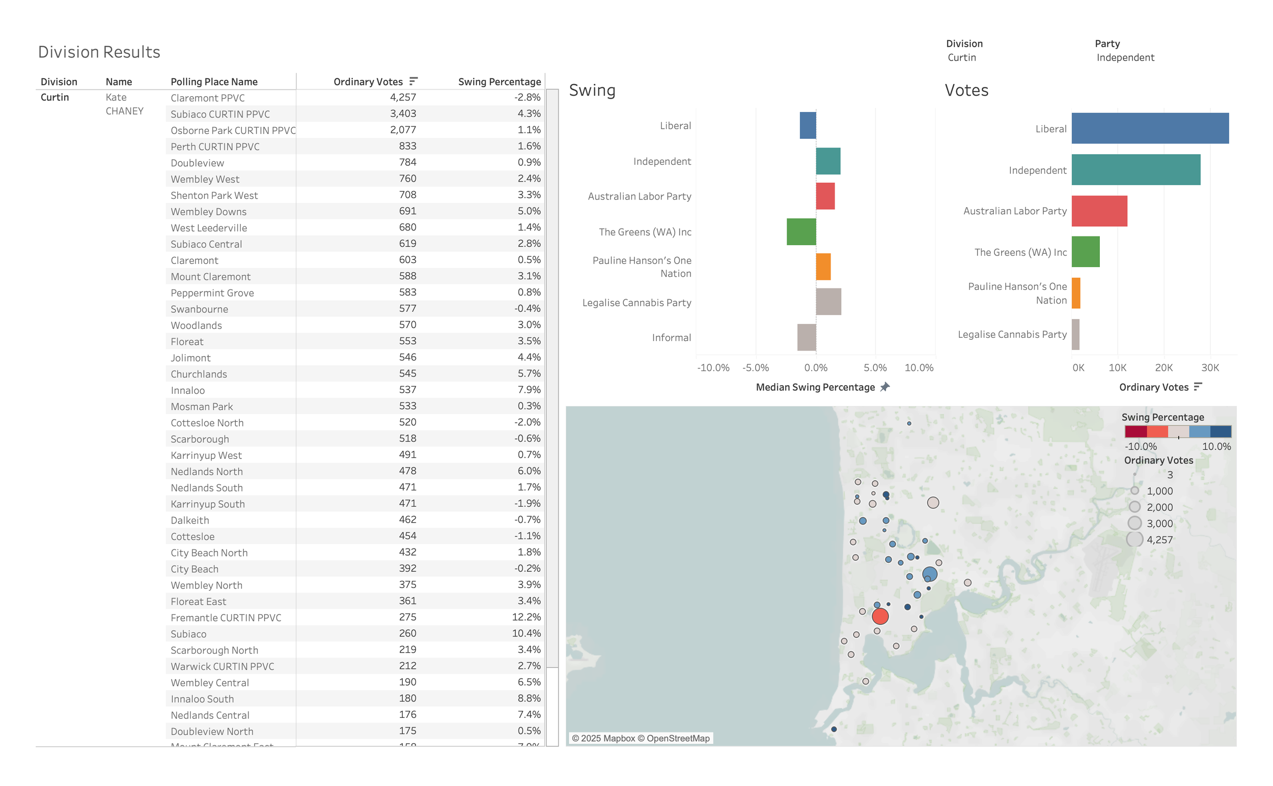
I’ve been working my way through some of the 2025 polling data and it makes for fascinating analysis. The wide variety of voting habits from polling place to polling place only a short geographical distance apart is a great indicator of how varied opinions and interests can be. I’m not going to offer any political commentary, as I’m nowhere near the right person to do that. I’ll just show some results for the Division of Curtin in WA, which was retained by Kate Chaney MP.