January 6 2025
What is the dashboard for?
Not always an easy answer
Data in a dashboard serves lots of different purposes. The dashboard in your car ideally tells you how fast you’re going, to a fairly high level of accuracy at a glance. If the fuel is starting to get a bit too low, or the engine is a bit hot, it’ll light up a warning. It doesn’t tell you the amount of fuel you have in the tank to two decimal places, because that is never going to be useful to you, nor does it tell you speed in 20 km/h increments. Half a tank of fuel is good to know about, less than a quarter, probably best to fill up, particularly if you’re driving in remote areas in Australia. You mightn’t get another chance. Speed needs to be fairly accurate for a host of reasons. Engine temperature, probably just tell me when it is a problem.
Dashboards for a business are pretty similar, really. They should ideally be built to answer a some specific questions for a user, at a practical level of granularity. That isn’t the only case though, and trying to fit everything into the best practice model will ultimately leave your users frustrated. There will be some users who just want a big pivot table that they can compare a whole host of different metrics. I actually quite like making these. Sure they tend to be a bit ugly, but more often than not, these are the types of things that actually get a lot of use from the users, and that’s what I see as being a successful dashboard.
It is very common for someone to spend a lot of time making a dashboard look attractive and highly interactive, only for the users to download the data out of it and put it into excel. It can be disheartening for the BI developer, and annoying for the user. Save yourself the heartache and give the user what they are after, and in time, add on the things like the ‘low fuel light’ equivelant. Having your users trust and rely on the data is the first step. You can build things up from there.
But when you are building out a dashboard and dealing with metrics, think about what level of granularity is actually important to your users. If you aren’t sure, ask them. If you’re dealing in millions, or hundreds of millions of dollars, it is probably fair to say you can do away with the decimal places and round things a bit. Always keep the scale in mind. Take it back to the car dashboard. Is the metric like your speed, fuel, or engine temp?
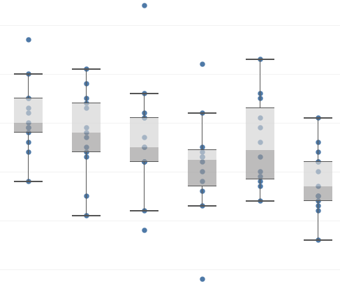
January 2 2025
When to use a box and whisker plot in a dashboard
Unfortunately, almost never…
I’m a big fan of box and whisker plots. I like how it gives you a feel for the spread of a data set in one graph. You get a median, a range, a skew, an idea of outliers. I even found them kind of fun to draw when I was in year 9 maths class.
So why do I so rarely use these visualisations that I like? Well, most people didn’t like drawing them in year 9 maths class, and as a result don’t really remember what they are or how to read them. When you’re building a dashboard the user is a critical consideration. That probably sounds obvious, but it is worth highlighting. The dashboard is for users to engage with, not a way for you to show off. You don’t want the users scratching their head trying to decipher the visualisation you’ve put in front of them as they’ll just avoid using it and go back to manual reporting. You’ll be frustrated at the wasted effort, and they’ll be frustrated by not having their problem solved.
What’s the solution? Well, its back to your users. Ask them what they like. If they aren’t too sure, give them a few different options to respond to. Maybe it is a histogram. Maybe a line/bar dual axis graph. Maybe it is a big number that turns green when it gets over a threshold and red when it is below another threshold. The user and the use case should dictate the solution, not the data person.
Originally posted to LinkedIn April 29 2022
The right job for the tool, or something like that…
Why the data tool that isn't right for you is still worth learning more about
My role at Kinesso is focused towards highly scalable and repeatable data processes. We don’t run processes for one account, we run it for hundreds or thousands. It is a global company, we’ve got a lot of clients, you get the idea. It requires a certain way of thinking when evaluating tools. In the past I’ve been quick to discard those which aren’t fit for our purpose as being not fit for any purpose. Whilst this is much easier for me, it has been limiting in actually learning new things about different tools and technologies around the place.
Lately I’ve been trying to approach things in a different way. I’ll still cross things off as not being useful to me today - of course I’m not going to start using something not fit for our purpose just to give the team a challenge – but I’ll spend some time trying to work out what situation a tool would work for. Would it work for a small retail business to help them understand their week to week without adding to the workload? Would it benefit a medium sized org with maybe 1 or 2 data people? Is it something an enthusiastic learner could pick up, or does it require dedicated data engineering? Is it a low maintenance solution that a consultant could set up and then the business can just get value out of with little or no maintenance going forward? Okay, the last one is never going to happen.
For data visualisation I generally prefer Tableau. Would I recommend a small/medium sized business trying to improve their finance reports sets up a Tableau Server? Probably not. They likely already have Office 365 and staff that are comfortable enough in excel, so Power BI it is. Maybe it is a startup heavy on G Suite? Well, Data Studio or Looker is probably the answer. For a data warehouse, I like Snowflake a lot. I don’t have their logo tattooed on my chest, but if you were to ask me what database you should use my response is a bit like the WG Grace quote about winning the toss in cricket:
“If you win the toss, bat. If you are in doubt, think about it, then bat. If you have very big doubts, consult a colleague, then bat”
If you want to set up a database, I think you should probably go with Snowflake, although cricket captains sometimes do win the toss and bowl – maybe your org is entirely on prem, Snowflake isn’t going to help you there. Although I would probably suggest you start moving to the cloud and quit stressing about whether the air conditioner in your data center is going to fail over summer.